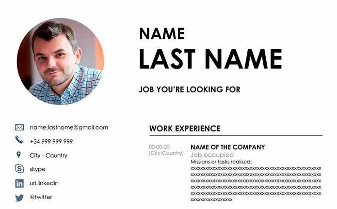
Layouts can make all the difference
There's no point in having a great personal summary and some amazing work experience included in your CV if you make it hard for the recruiter to find the nuggets of information. Your layout needs to enable the recruiter to scan the page and pick out the key elements for them.
One survey of recruiters had the estimated time of scanning a CV at just 6 seconds. This means, if the recruiter has to spend valuable time hunting your current job then you'll likely end up in the no pile, with no opportunity to get in a room with them and explain how perfect you are for the job.
One page or two?
This is an age-old question. How long should your CV be?
I can tell you now, without any further debate, that it should definitely NOT be any longer than 2 pages of A4. Once you're into three pages you haven't focused your skills and abilities enough, and are verging on the life story end of the scale.
I was once sent a CV to review that was 5 pages long. 5 pages! If you can't get my attention on the first page, then I'm not going to be digging around at the bottom of page 4 trying to find a reason to pick up the phone and invite you in.
The likelihood is that you aren't the only applicant for the role you've applied for, so you're in a competition. To give yourself the best chance of winning, don't make it hard on the competition judge to find a reason to award you with the prize.
Therefore, we're down to your CV being either 1 page or 2 pages long, and I think this comes down to the stage you're at in your career.
If you're at the early career stage, or looking to transition, then you're experience might be a little light, so 1 page could do the job. If you're a little more seasoned, then 2 pages give you the opportunity to share more about your experiences.
One column or two?
This one does depend a little on the font size and line spacing that you've chosen, as the smaller they are the more you'll need to break up the text into columns to prevent really long lines of text, however, for a standard font size (12pt or 14pt) then two columns really does help you lay things out in a way that supports easy scanning. The columns would typically be split 1/3 and 2/3, and typically in that order.
The more narrow column would contain the short snippets of information you'd need in your CV, such as contact details, education, and training courses. This leaves the wider column for the bulk of your content, such as your personal summary and work experience.
Headings, dividers, and colours
A further element that supports a recruiter in scanning your CV is the way that you can make clear divisions between different sections.
This can be done in a variety of ways, including:
Headings - these can be in different fonts, different sizes, in a different colour, or just in bold, but the change makes it clear to the recruiter that the content is changing. However, make sure every heading is the same style, or it just becomes confusing.
Dividers - these can be anything from simple horizontal or vertical lines to colour lines, dotted lines, or even just larger areas of white space. The aim is to indicate a change from one section to another.
Colours - if you're using the two-column approach, then it's often a good idea to shade the narrower column, as this makes a clear distinction between areas and focused the attention on the core content of your CV.
Example CV layouts
Here are some links to some nice CV layouts that illustrate what we've covered above.


